Wednesday, November 30, 2011
Two Women in the country
Two Women in the Country by Willem De Kooning is an oil, enamel and charcoal on canvas. In the book, the painting was in black and white. Now that i see it in color, I can see the shapes that shows the figures are actually women. Also, you can distinguish between the two. I like the colors and the sketches of the two women.
The Blindman's Meal
This is a piece done by Picasso in 1903, during his blue period. It is done using oil on canvas. It is in the Metropolitan Museum of Art on a 95.3 x94.6 cm canvas. This image shows a blind man having a meal of just bread. Picasso was depressed during his blue period and felt that humanity was suffering, which is depicted in this piece. Picasso purposely made his fingers lanky and his shoulder oddly positioned to convey this feeling.
Vincent Van Gogh Self Portrait
This is a self-portrait painting by Vincent Van Gogh. This painting was made in 1888. The media used in this painting is oil on canvas. The artist uses an array of implied texture throughout the painting to portray the felt hat, jacket, and the subject's facial hair. The background of the self portrait painting by Van Gogh also contains texture that blends in with the subject. I chose this painting because it is a self-portrait like the ones we are working on in class and it incorporates the element of texture.
Picasso: "Weeping Woman"
This is a 608 by 500 mm oil on canvas painting, done by Picasso in 1937. This painting is called "Weeping Woman." I chose to do this painting because this painting is known as an abstract painting, and this is our next assignment in class. I thought it would be more interesting to see a famous painted abstract painting rather than looking at one from an unknown artist. Picasso is well know for these types of paintings. At first you look at such a painting like this and you wonder how it was even approved to be known as art since you can barely know what it is and many wouldn't agree that this painting is so called "pretty" compared to others. But Picasso was original within his artwork in which is a great technique in the art industry. I think Picasso is a very good artist and i think this abstract painting well describes the point of knowing that art can be art to some that may not seem like art to others. Abstract paintings are interesting in a sense that behind that painting you can see the personality of the artist in what they include into their artwork.
The Tree Dancers
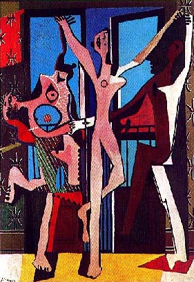
The Three Dancers, Pablo Picasso, 1925. I liked this painting because it is abstract and I like the colors, he used cool colors with a hit or warm. I also like how Picasso used the different shapes to make the bodies and the instruments. I choose this painting because it gives me an idea to get started with my abstract drawing.
Firedance
"Firedance" was done by Mark Tobey in 1957 and it is considered to be abstract. This piece of work was done by sumi ink and pale gray wash on Japanese paper.
Within the work, black forms seem to be jumping, almost as an expression. According the text, the black against the white background is for a dramatic effect. Although it is impossible to say exactly what type of emotions are being shown within this piece of work, it is obvious that whatever feelings Tobey was trying to convey, he was really expressive about it.
The reason why I chose this piece of work is because we are doing it in class as our last project and without even reading the words "jumping figures" - I immediately picked up on the fact that the author was expressing something with excitement.
Three Musicians
The "Three Musicians" was painted by Pablo Picasso. It was done in the year of 1921 in Paris, France. The media is oil on canvas. I thought this was interesting because it exemplifies two of Picasso's pieces of art. One version is displayed in NYC and the other at a museum in Philadelphia. The men in this painting were his close friends back in 1910. Cubism is the theme throughout this piece of art, is was a 20th century art movement.
Jackson Pollock
This is a painting done by Jackson Pollock titled No. 9, 1949. I chose to blog this painting because our topic this week is Abstract art. I find this painting interesting because of the technique he used to create it. Rather than use standard painting methods, he would apply the paint to the canvas by dripping the paint onto his paper. He also used a stream of consciousness technique to create his paintings, which I found interesting because this actually came up in one of my psychology classes. Another cool thing about his paintings is his perspective on painting and where he placed his canvas. When creating the painting, the canvas would be placed on the the ground. The purpose of this according to Pollock was that gave him alot of perspective on the painting because he could walk around and view it from all four sides. Pollock also stated that this allowed him to "literally be in the painting". I find his approach and views on painting to be really interesting because its very out of the box and different but still produces cool works in my opinion.
Thursday, November 17, 2011
The Persistence of Memory by Salvador Dali
This painting maybe the most famous painting by Salvador Dali, The Persistence of Memory was created in 1931 and is now displayed in the Museum of Modern Art in New York City. Salvador Dali introduced the melting pocket watches in this piece.
Michael McNicholas
This painting maybe the most famous painting by Salvador Dali, The Persistence of Memory was created in 1931 and is now displayed in the Museum of Modern Art in New York City. Salvador Dali introduced the melting pocket watches in this piece.
Michael McNicholas
Nativity
This is a painting by the famous artist Giotto di Bondone. I learned about this painting in my art history class. What i learned about it was the composition. The flow is constant to the right with foreshortening. The colors that strike you are primary colors such as the yellow used on the cloke and half. Everything in the picture is organic besides the structure that is holding baby Jesus.
The Scream
This painting is a one perspective painting done by Edvard Munch in 1893. This painting is oil, tempra, and pastel on cardboard. This is a classic painting and I was not aware it was a one perspective until I did some more research. Something interesting I found out was that in 2004 this painting was stolen from Munch Museum and then a few years later it was recovered in 2006. They had sustained some damage but they were put back on display in 2008.
Anamorphic Drawings
Julian Beever is the artisit of these anamorphic drawings. A student posted one of these paintings last week and i was fascnited by it so I decided to post one of my own. These drawings are created to be viewed from a certain view. They are meant to be life like and 3D. These paintings are not permanent.
City Street
This is a one perspective drawing of a city street that I found on google images. It is drawn by an unknown artist. I like this drawing because it is a quick sketch and has simple detail. It is done using pencil and has a vanishing point to the left of the paper which is more interesting than the middle. The town itself looks deserted, and has an eery sense to it which adds to the creativity.
O.P.P.
This picture is awesome! Its a photograph. I'm not sure who did it or the history behind it, but it really caught my eye. One of my favorite things to see in art is black and white. The other is the sky! Its one of those naturally beautiful things that you really can't explain in words why you like it so much but you just do. It does what art does. Its inspiring, innovative, and a wonder of God.
This is a painting done by Robert Sloan. I new our upcoming project was one dealing with oil pastels so I researched those drawings. I came across Robert's website and was intrigued by some of his drawings. This one in particular I liked. You notice the detail he was able to accomplish using just oil pastels. All the different colors blended together very nicely. I also think the eagle screams America which is another nice touch.
Rainy Day
This is a two point perspective oil on canvas painted by Gustave Caillebotte. He is most noted for being a French Impressionist painter. I really liked this because i struggled to do a simple one point perspective drawing and this is a very complicated and very detailed and i appreciate all the work that went into it to make it so beautiful.
Scotch Plains House Portrait
this is oil painting of a house. This picture has nice colors. the artist was mood by the warm color of spring. the trees are changing colors. the house has very nice detail. looks very real. the artist was a woman name Sharon Sayegh. she had a collection of painting like this. they are called High Land Park houses.
Water Lillies
This is a painting by Claude Monet called "Water Lillies". This painting was made in 1908. The media used in this painting is oil on canvas. The artist uses cool colors to portray the pond water and warm colors to portray the lillies. The aim of Monet's painting was to supply the illusion of an endless whole of water without horizon or bank.
King David
This fifteenth-century sculpture is the bronze David by Donatello. an early Renaissance Italian artist. David often known from the Bible Story of "David and Goliath". There was a battle going on between the Israelites and the Philistines. Goliath was the champion warrior of the Philistines and he would beckon the Israelites twice a day to send out one of their own to fight. King Saul at the time and the rest of the army were afraid.
Now David (the future king) was very young, fair, beautiful and tended after the flock. He went out to battle as well but to help out with water and minute things like that. But one day, David accepted the challenge. His brothers laughed at him, but reluctantly King Saul gave the small but brave David his hefty armor. David said to Goliath “This day the LORD will deliver you into my hand, and I will strike you down, and cut off your head..." THAT'S deep. Long story short David kept his promise to Goliath, slayed him with a sling and sword and swipe his head right off by the sword.
As far as the sculpture is concerned, I like it because of the story it represents. I understand how Donatello was trying to portray the "fairness" of David because he was young, and pretty for a boy. But I don't like his stance, at all, or the total fact that he looks like a girl in this art piece. Nevertheless, I really like the story behind the sculpture.
American Gothic
This is the famous American Gothic picture by Grant Wood. This is obviously a paionting and it shows how life was back in the early 1900's. The man holding the pitchfork on the farm shows the hardlabor and the woman with the apron on shows the roles of woman back in the day. This is a notorious picture that depicts how life was and the roles of men and woman, for men to work out in the field and for woman to work in the house.
Grant Woods
Grant woods "American Gothic"
After doing research on the painting, I found out that this house is in Iowa and the people chosen was his sister and their dentist. I like the picture because it looks realistic. Woods call it American Gothic but the man is holding a farm fork and if you observe the painting more, you can see the red barn in the corner. The painting itself look realistic.
Canaletto: Perspective
Canaletto: Perspective, Oil on Canvas, 1765. Giovanni Antonio Canal, known as Canaletto, painted many landscapes. I liked this painting because it is of the inside of a building, many of his paintings are from the outside. I like how this perspective curves and goes straight back. I also like how there is so much detail in the furthest point of the painting. Not only is this perspective done very beautifully but the color are so rich and gives so much meaning and that is why I liked this painting a lot.
The Flapper's Hat
This is an oil pastel drawing by Connie Chadwell. It is called "The Flapper's Hat". I picked this drawing because it caught my attention, and I also searched for something like this due to the fact that we are planning on doing art with oil pastels in class. I think it caught my attention due to the subject, the choice of colors, and the brilliant use of shading.
Wednesday, November 16, 2011
Cafe Terrace at Night
"Cafe Terrace at Night" was painted by the famous Vincent Van Gogh in 1888. This painting is located in Arles, France at the northeastern corner of the Place de Forum. The media used was oil on canvas. I chose this because it reminded me of the recent project we had in class of either one or two-point perspective. This would fall under the category of two-point perspective. The colors and texture Van Gogh incorporated in this painting intrigued me.
Swans Reflecting Elephants
This is Salvador Dali's 1937 painting Swans Reflecting Elephants. Dali is a surealist painter. In this image one can see the swans necks and wings which take on the form of trunks and ears which reflected in the water creates the image of elephants. This piece was created during his paranoiac critical period. Dali merges hallucination and reality.
The persistence of memory
This is Salvador Dali's oil on canvas painting called "The persistence of memory". Created in 1931 and now it is at the MoMa in NYC, it is considered one of his most famous works. Dali used faint brown, yellow and blue colors in this painting. The meaning of the painting is up to interpretation, some believe it is about the non existence of time during sleep only memories, and some believe since Dali was also a philosopher that it is about Freud's psychoanyalis. Dali called his paintings hand-painted dream photographs.
Flower Carrier
" The Flower Carrier" was created by Diego Rivera in 1935. This piece of work was done by oil and tempera on masonite. Within the picture, it is said that the woman behind the man, is his wife who is trying to to help him get up. According to some information I found, it was said that the man does not see the beauty in the flowers - just their value and what it will be when he makes it to the market.
The reason why I picked this particular piece of work is because I was drawn to the colors that were used. While looking up work by Diego Rivera, I found that most of his work has to do with a man carrying something on his back - this isn't the first one. Unfortunately I couldn't find the symbolism behind it and just found it very interesting.
This Painting is titled Skull of a Skeleton with Burning Cigarette. It was created by Vincent van Gogh and the media was oil and canvas. The actual year that the painting was created is unknown but is believed to be from the period between November 1885 and January 1886. There is speculation that the painting was created as a joke and this type of “humor” is seen in another work of van Gogh which portrays a skeleton hanging with a cat in the background. This information comes from the website of the Van Gogh Museum. I found this painting interesting because it shows a skull, which is dead, smoking a cigarette, which is something that living people do. By doing this it seems like he gives life to a dead object.
Perspective Street Corner
This is just a general view of no one specifics work, but i decided to blog about it. This perspective drawing is done from a two point perspective. I chose this perspective drawing our of all the other perspective drawings out there because this is the angle of the building in which i am doing in class. Looking at this piece of artwork shows me that if this is what it could turn out to be then i should finish it. I like how this artist not only did the lines of the perspective drawing, but they also did some shading within it as well. You could tell that this piece of artwork took some time and thought into it. I decided to choose this piece of artwork because this is my first time doing a perspective drawing myself so i thought it would be interesting to see how others were done.
In The Box
This piece was done by Mary Cassatt in 1879, oil pastel on canvas. I chose this piece mainly because it was my favorite out of all the pieces that she did and I particular liked the history behind what Cassatt had to go through. She was one of the very few women who was part of the Impressionist movement and had to struggle against her father's objections to be a painter and faced social pressures (women were not allowed to use live models) and she decided not to get her degree and moved to Paris and was closely associated to Edgar Degas. And because of all she had to go through she became successful as well as a famous artist who was also the first to begin the Impressionist movement in America and was a role model for young artists.
Tuesday, November 15, 2011
The Natural Way To Draw
This is an example of a gesture drawing done by an artist known as A. Radley. The purpose of gesture drawings is to capture a movement of the object as a whole, not in parts. A gesture drawing is not about consciously thinking about the next placement of the pen/pencil/paintbrush,etc. it is about going with the immediate thought of what the artist feels the emotions of the object is. It is said that to help in drawing an object, instead of a person, for a gesture drawing is to think about why it is there. This image was drawn as the artist was watching a dancer in a studio
Thursday, November 10, 2011
Girl with a Peal Earing
This is a classic painting done by Johannes Vermeer in circa 1665. This is a classic painting which is oil on canvas.
The Tree
This is a sidewalk painting by Edgar Mueller called "The Tree". Edgar Mueller is a master of illusions. The artist uses two-point perspective to create the illusion of the tree rising up from the ground. The artists use of warm and cool colors creates a drastic effect as if the tree is rising from the earth's core. The media used in this painting is paint on sidewalk. This painting was completed in April of 2011 and is located in Denmark.
One perspective
This is a drawing I found on a website a art teacher had created. He showed his art class Raphael's School of Athens, and they watched masters of Illusion and they all created there own one point perspective drawings. This website caught my eye because it was very similar to what we did in class. After his art students learned the rules they all made their own drawings whether or not it was a exterior or interior space. This drawing I selected is very similar to what my drawing in class is, it is a interior space of a room. I like how he made the back wall seem so distant, and I like how he used cross hatching all along the walls and on different pieces of furniture.
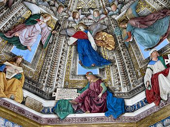
This was done by Melozzo da Forli, who was an Italian Renaissance painter and architect who is well known for his fresco paintings, which are mural type paintings done by using plaster on walls. It's currently found in the Vestry of St. Mark's at the Holy House of Loreto, Italy. I chose this because it is an amazing portrayal of one point perspective, where the vanishing point is located off the painting. Melozzo is also know for his use of illusion, and how it seems as though we are looking up at these angels from a worm's eye view.
One point perspective Example
This painting follows the rule of one point perspective. I like this painting because it has color. It looks like even the trees are in one point perspective. The color adds so much more depth to the painting and it looks like it everything follows the rules of one point perspective. So this painting adds more than one point perspective element it includes color and it also adds shadows that add more depth and 3d.
Picasso
This a picture of a woman created by Pablo Picasso and was made with paint on paper. The reason I chose this was because its good to look back at the famous painters and reflect at their unique style. No one has a more unique style than Picasso, and his use of figures and body parts to create this woman, is very different than everyone else's style which makes him stand out.
One Point Perspective
This blog i chose to do a one point perspective drawing that was to be used in plans for a house. this is also very similar to what we are doing in class because it has one vanishing point and all the lines that are being used are either perpendicular, horizontal or connected to the vanishing point which makes this a great example of a simple one point perspective drawing.
One point perspective
This is a one point perspective of a room just like the project we are doing in class. The horizon line is right in the middle of the back wall and the wall boards are made through the vanishing point. It is colored with colored pencils on paper. All the lines follow all the rules with one point perspective, which are parallel lines to the horizon or perpindicular lines to the horizon.
The problem we all live with
The problem we all live with, Norman Rockwell, 1960, painting. Norman Rockwell was an admirer of Rembrandt, he was admired for his realism in abstract paintings. Rockwell painted real life events that we the struggles of his time. I like this painting because of the story and history behind it, but I also like texture displayed in the painting. This was painted to depict the American Civil Rights struggle of 1960. This girl is Ruby Bridges on her first day of first grade that the judge ordered desegregation. This painting is used in schools to teach students about the struggles of the 60's and the segregation that existed in schools.
Maya a la Poupee
"Maya a la Poupee" was painted by Pablo Picasso in 1938. The media is oil on canvas. It is a painting of his daughter Maya carrying a doll. The colors and the distorted image caught my eye. Picasso had a unique way of expressing all of his images. The story behind this painting is interesting because it was one of the two creations stolen from his granddaughter in Paris, France.
Wednesday, November 9, 2011
"Dogs Playing Poker" by Cassius Coolidge
This Painting was done by Cassius Coolidge. The name of his piece is "Dogs Playing Poker." I chose this piece of art to blog about because i thought it was quite interesting to see a bunch of dogs sitting down at the table playing a game of poker. In general dogs do not sit at a table at all nor do they play a game of poker, but the way that this artists painted this piece made it very interesting for viewers to pass up even though it may seem to be unrealistic. I like how this artist use a lot of color within his piece. He could have used the same colors for each dog, but instead he used different shades and colors to show the viewers that there are different "dogs" playing. Coolidge's painting is a very successful painting in which I personally would think about buying. The color and shading is the first things that tend to catch people's eyes and the more it catches someone's eyes is the way his piece gets sold. Coolidge's piece gives out the mood of happy and excitement, which would also make people want it in their house. All in all i think this piece is one of his best painting done yet.
Le cafe du nuit
This is one of Van Gogh's most famous oil on canvas paintings done in September of 1888. It stands at 72.4 cm x 92.1 cm at Yale University. It is done in one point perspective. After researching the painting I found that Van Gogh did not use the colors that were reality, but the colors that conveyed emotions. He felt that a cafe is a place where people can ruin themselves or go crazy. He tried to convey that chaos by using contrasting color.
Sistine Chapel
The Sistne Chapel is considered High Renaissance art and was a painting done by Michelangelo at the commission of Pope Julius II. The painting can be found on of the ceiling of the large Papal Chapel within the Vatican.
The interesting fact that I read about was that in the central part of the painting, Michelangelo created nine scenes from the Book of Genesis which is best known for the creation of Adam. Within the painting, the viewer may notice countless imitations of the hands of God and Adam.
My favorite part of the painting is that no human within it is alike, meaning that are all either clothed or naked and painted in different positions and ways. Michelangelo also used good shading and interesting colors that really captures the eyes of his viewers.
One point train tracks
Christinas World
This is Andrew Wyteh's "Christina's World", it is tempera on panel done in 1948. The woman in the picture, Christina, had polio and would crawl around the grounds of the farm. The painting is asymmetrically balanced, and was done in egg tempera a medium that makes an artist constantly mix and monitor their paint. There is great detail in the strokes in the grass.
One Point Perspective
This is a drawing made using the one point perspective technique. It is a drawing by a student so I don't know the name of the artist. It is one point perspective because it is drawn with the object, the ground, being flat on the picture plane. Also it is drawn with respect to a single vantage point which lies in the middle of the street in front of the bird. I chose a drawing dealing with perspective because this is on of the topics we are covering in class this week. I chose this particular drawing because of where the view point is from. While searching for a perspective drawing I found that most were from a ground level. This one stood out because it is drawn from the sky while using the the ground as the object on the flat surface. The detail used in the drawing is also very good and the addition of the bird and people on the ground gives it some realism.